What different world maps get right - and what they get wrong
As the UN adopts a new world map to reflect Africa's true size, let's take a closer look at what different maps get right and wrong.
10 articles from BBC News, NPR World, Fox News, France 24 and 5 more.
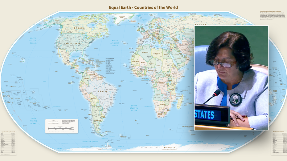
The United Nations General Assembly voted 164-1 to adopt the Equal Earth map, which more accurately represents Africa's true size compared to the traditional 16th-century Mercator projection. The Togo-sponsored resolution was backed by African nations and passed with the United States as the sole dissenting vote. The new map projection encourages governments and institutions worldwide to replace the Mercator map, which has distorted the relative sizes of continents, particularly making Africa appear smaller than it actually is.
AI-generated summary of 10 source articles. Not original reporting — every claim links to its source below.
Several outlets led with the US voting alone against the resolution, emphasizing American exceptionalism and the unified international backing. This framing highlights diplomatic division rather than the cartographic change itself.
NPR World · Fox News · Fortune
These outlets framed the vote as addressing long-standing technical flaws in map projections, explaining what different maps get right or wrong. The focus is on correcting historical distortions rather than political messaging.
BBC News · Al Jazeera · Japan Times
This angle emphasizes that African states sponsored the resolution to counter perceptions of the continent as peripheral, treating the vote as part of a broader decolonial project. The framing connects cartography to representation and power.
France 24 · Times of India
This outlet focused on how the change affects individual nations' representations on maps, highlighting France's decision to adopt the new projection. The emphasis is on concrete government action rather than the UN vote itself.
Euronews
AI analysis of how 9 publishers framed this story, based on their headlines and summaries. A description of the coverage, not a judgement of any outlet.
As the UN adopts a new world map to reflect Africa's true size, let's take a closer look at what different maps get right and wrong.
The U.N. has backed a new map showing Africa in its true relative size, with the U.S. standing alone in opposition.
The Togo-sponsored resolution was backed by 164 nations - the US the only nation to vote against it.
The United Nations adopted the Equal Earth map showing Africa's true size, but the United States was the sole nation to vote against the resolution.
The United Nations on Friday voted for a shift away from the 16th-century Mercator global map towards one more accurately reflecting countries' true size, a resolution sponsored by African states to counter perceptions that the continent is peripheral.
France is redrawing its world map: deeming the Mercator projection misleading, the foreign ministry will drop it in favour of a map that better reflects actual continental sizes, especially Africa.
The vote encourages governments and institutions around the world to replace the traditional Mercator map, commonly used since the 16th Century, with the Equal Earth projection.
The UN General Assembly has backed a resolution to change to maps that more accurately show the true size of Africa.
The new map — known as the Equal Earth cartographic projection — improves "the accuracy of the cartographic representation of the world," the resolution said.