What different world maps get right - and what they get wrong
As the UN adopts a new world map to reflect Africa's true size, let's take a closer look at what different maps get right and wrong.
6 articles from BBC News, CBS News, Fox News, France 24 and 1 more.
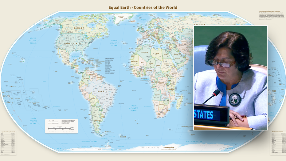
The United Nations General Assembly voted overwhelmingly to adopt the Equal Earth map, which more accurately depicts Africa's true size compared to traditional maps based on the 16th-century Mercator projection that have long represented the continent as smaller than it actually is. The resolution passed 164-1, with the United States as the sole country voting against it and six others abstaining. African states sponsored the resolution to counter perceptions that the continent is peripheral, and the vote encourages governments and institutions worldwide to replace the Mercator map with the more accurate Equal Earth projection.
AI-generated summary of 6 source articles. Not original reporting — every claim links to its source below.
As the UN adopts a new world map to reflect Africa's true size, let's take a closer look at what different maps get right and wrong.
The United Nations General Assembly voted to adopt a new map that more accurately depicts Africa's size. The U.S. was the only country to vote against the map, while six other countries abstained.
Africa has long been represented as smaller than its real size in maps, which are largely based on an ancient projection.
The United Nations adopted the Equal Earth map showing Africa's true size, but the United States was the sole nation to vote against the resolution.
The United Nations on Friday voted for a shift away from the 16th-century Mercator global map towards one more accurately reflecting countries' true size, a resolution sponsored by African states to counter perceptions that the continent is peripheral.
The vote encourages governments and institutions around the world to replace the traditional Mercator map, commonly used since the 16th Century, with the Equal Earth projection.